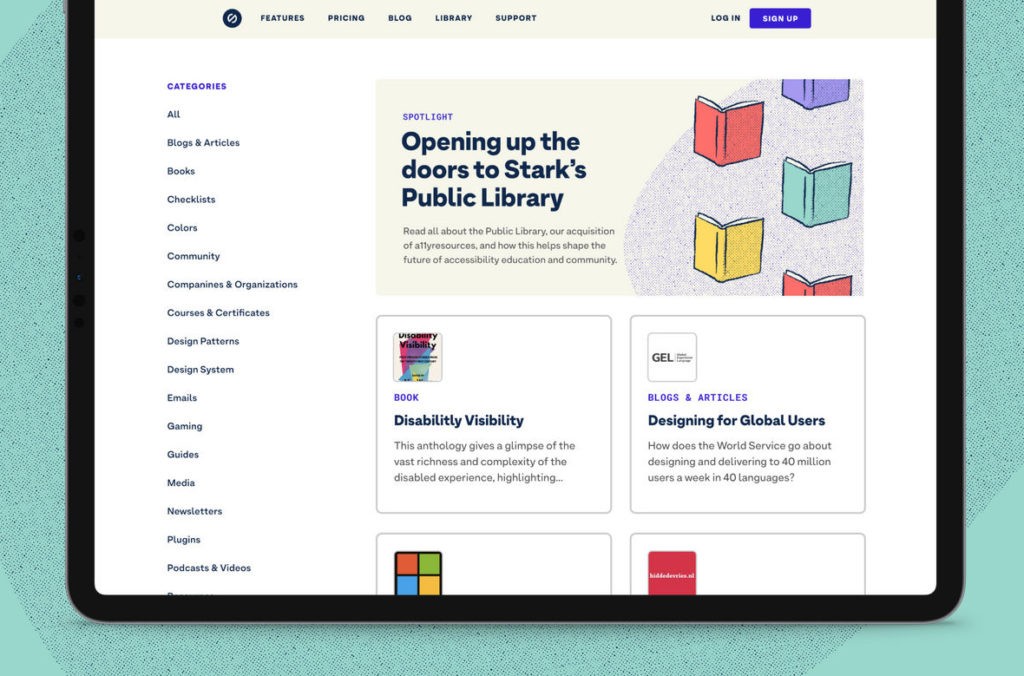
While Stark users are still raving about the recently added Focus Order feature, the company has delighted accessible software advocates with the launch of its Public Library—the “largest, centralized accessibility resource on the Internet”.
“It’ll be essentially a guide to getting started with accessibility for your entire team, from designers to stakeholders,” Stark’s co-founder and CEO Cat Noone told 150 sec in an interview.
The first version of the library contains around 1,000 carefully curated accessibility content items, from articles and tools to courses and guides on a broad spectrum of topics like gaming, software and tools, and standards.
Founded in 2017, Stark is taking steps toward building a world where software is more accessible and more people are aware of the importance of designing and building with accessibility in mind, given that one billion people or 15% of the global population experience some form of disability.
The platform offers a suite of integrated tools that helps designers and developers make products that are usable for people with different kinds of disability—right from the start and using their design software of choice that in turn optimizes their workflow.
The idea of aggregating value-adding accessibility content in an easy-to-digest, human-readable format was born when Stark realized that the education gap is a core part of the problem with regard to accessibility in technology.
“The education in this space in and of itself is inaccessible, which we always found to be irony at its finest,” Cat wrote in a blog post announcing the launch of the Public Library.
She maintains that many people turn away from accessible design because they cannot easily find accurate and relevant information on the Internet. Even if they do, Cat says, the difficult-to-understand nature of such resources scares them off.
Acquisition of a11yresources
To expedite its education roadmap, Stark acquired a11yresources that belonged to Hannah Milan, who has been contributing to the accessibility community for years.
She has joined the Stark team as a Community Advocate, and Cat is all over the moon as she believes Hannah is the perfect fit to expand their world and product offering.
The library, which also features content produced by Stark, will keep growing and a number of features are expected to be added to it. These include an events section.
“We want users to be able to sign up to attend events with authors and public figures that are having discussions about topics like accessibility in tech, disabilities, and inclusion,” said the CEO of Stark, which has been used by over 300,000 designers, developers, and product managers at companies of all sizes.
And her blog post offers something exciting to look forward to post the coronavirus pandemic.
“Realistically, the days of COVID will eventually be behind us. When it’s safe, the Stark Public Library will make its way to a city near you—through our team and many of the Stark members around the world,” Cat wrote.
Focus Order
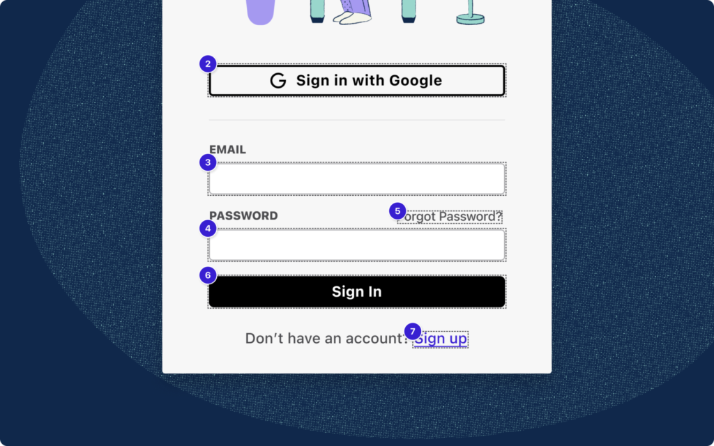
The opening of the library comes on the back of the launch of a game-changing feature called Focus Order, which ensures individuals not using mouse gestures or swiping—be it from preference or disability—can easily “tab” through a product.
If users cannot access elements in an order that makes sense, Cat says, they are lost on the page with nothing to interact with.
“And that’s frustrating, especially if it’s someone’s finances or health,” she explained, adding that it not only adds a ton of confusion but also could result in losing a customer.
That is why user interfaces should be designed and implemented in a way that ensures they can be used without a mouse. A real-life example is when an individual needs to create or sign into an account or complete a form.
“If the form field is not tabbable, they cannot fill out that form. What Focus Order does is bring that item into life so that users can actually interact with it,” Stark’s co-founder said.
It actually gives developers the ability to create a meaningful experience for users right when they are designing and makes communication easier for handoff to engineers and in meetings with stakeholders, she explained.
“With just a few clicks, creating a sequence order and adding focus items on your screens make it ridiculously easy for you as a designer to further communicate the intent of your design for all users, and enable your engineer colleagues to truly understand how they should build that out,” the Stark team wrote in a post addressed to its users.
This creates a better experience within the team, Cat says. “If the team internally can’t get on board with something, it doesn’t move forward to the customer.”
The feature is available to both free and paid members, with paid users gaining access to create more sequences.
The goal for stark is workflow optimization for designers and engineers, the designer-turned-entrepreneur emphasized, adding that the new capability is in line with that mission. “Everyone has been absolutely raving over it.”


